> For the complete documentation index, see [llms.txt](https://docs.opendatadiscovery.org/llms.txt). Markdown versions of documentation pages are available by appending `.md` to page URLs; this page is available as [Markdown](https://docs.opendatadiscovery.org/features/data-quality/dashboard.md).
# Quality Dashboard
The catalog-wide Data Quality Dashboard at /data-quality — three breakdown rings, six anomaly-class metrics, and the per-side filter sets for tables and tests.
The **Data Quality Dashboard** at `/data-quality` is the catalog's cross-entity quality view. It builds on top of the test results imported through the [Test Results Import](/features/data-quality/test-results-import.md) paths — Great Expectations, dbt, `odd-collector-profiler`, and custom frameworks — and renders them as one operator-friendly summary.
Quality checks are not performed inside ODD Platform — the dashboard surfaces results from the integrated tools.
{% hint style="info" %}
**The dashboard is visible to every signed-in user.** The `/data-quality` route carries no per-permission gate, and the aggregate it reads requires only that the caller be authenticated — there is no dedicated data-quality permission. Every signed-in user therefore sees the catalog-wide health of every dataset; under [`auth.type=DISABLED`](/configuration-and-deployment/enable-security/authentication/disabled-authentication.md) the dashboard is open to anyone who can reach the platform. The filters narrow what *you* are looking at; they do not restrict what a given user is *allowed* to see. If the mix of failing datasets is itself sensitive in your deployment, put the platform behind a network perimeter rather than relying on a dashboard-level permission that does not exist.
{% endhint %}

## Three breakdown rings
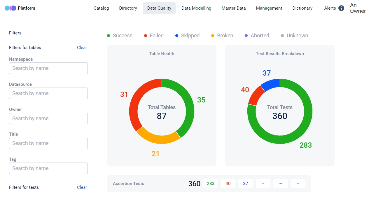
The dashboard's hero row is three pie charts, each computed across the catalog at the time the page is loaded:
* **Table Health** — the count of tables broken down by their aggregate health status, rated by a **priority cascade**: the highest-severity latest-run status on any of a table's tests decides the table's slice. The UI labels four slices — a table is **Error** when at least one latest run is **failed**; **Warning** when at least one is **broken** (and none failed); **Unknown** when at least one is **unknown** (and none failed or broken); and **Healthy** when none of those apply — i.e. its tests' latest runs are only *success*, *skipped*, *aborted*, or *running* (a currently-running test does **not** degrade a table's health). Searching the dashboard for a "broken tables" count will not find that label — *broken* latest runs roll up into the **Warning** slice and *failed* into **Error**.
* **Test Results Breakdown** — the count of **tests by their latest run's status**, across the same status set as the per-test [Test Run History](/features/data-quality/test-run-history.md) filter (**Success**, **Failed**, **Skipped**, **Broken**, **Aborted**, **Running**, **Unknown**). A test's *latest* run includes an **in-flight** one: a test that is currently running counts under **Running** (the in-flight run becomes its latest run, then is replaced by the terminal status once it finishes). See the disclosure below — this is **not** a count of individual runs.
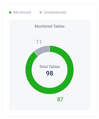
* **Monitored Tables** — the count of tables broken down by whether they are monitored (have at least one DQ test) or unmonitored.
The "Monitored vs Unmonitored" framing applies specifically to **Table-type datasets** — the catalog's primary tabular entities.
{% hint style="warning" %}
**Test Results Breakdown counts tests, not runs.** The "Test Results Breakdown" ring (and every per-category total on the right-side matrix) aggregates **distinct tests, each represented by its latest run only**. A test that has failed 100 times in a row contributes a single entry to the "failed" count — the dashboard shows **1 failed**, not **100 failed**. The underlying table (`data_entity_task_last_run`) carries one row per test, keyed by the test's identifier, holding only the most recent run's status.
This matters most for **compliance and audit** reading. "How many test failures last week" answered from this dashboard returns "how many tests are currently failing on their latest run" — a smaller and structurally different number. For the per-run history of any individual test (every run, all states), open the test's [Test Run History](/features/data-quality/test-run-history.md) page from the test's detail surface.
{% endhint %}
## Six anomaly-class metrics
The right-side matrix shows the breakdown of failures across the six anomaly classes the platform recognises. The cards are ordered **alphabetically by category name** — not by failure count, severity, or test volume. An operator opening the dashboard to find "which category is failing worst" must scan all panels; the panel order conveys nothing about quality. Each metric represents a dimension of data quality:
* **Assertion Tests** — validations or checks put in place to ensure that specific conditions or assertions about the data are met.
* **Column Values Anomalies** — irregularities or unexpected values in the data that deviate from a predefined set of acceptable or standard values.
* **Freshness Anomalies** — staleness signals — checking whether the data is up-to-date and falls within the acceptable time frame.
* **Schema Changes** — modifications in the structure or organization of the data, with a focus on monitoring whether the data schema remains consistent over time.
* **Unknown Category** — data placed into a category that was not foreseen or specified in the established data model or schema.
* **Volume Anomalies** — unexpected changes in the quantity or volume of data.
Each per-category total at the top of the card uses the same latest-run-only semantic as the headline Test Results Breakdown ring — see the disclosure above.
For each of these metrics the dashboard assigns statuses to the checks, distinguished by colors for better visualization:
Checks Statuses distinguished by colors
## Monitored vs unmonitored portions
Beyond the per-anomaly breakdown, the dashboard reports what portion of data was monitored and what portion was skipped:
Monitored / unmonitored tables portions
This applies specifically to Table-type datasets — the catalog's primary tabular entities.
## Filtering
Filter the dashboard by five dimensions: **Namespace**, **Datasource**, **Owner**, **Owner title**, and **Tag**. The filters apply on **two separate sides**:
{% hint style="warning" %}
**The "Owner title" filter is the ownership role, not the dataset name.** The **Owner title** filter matches the [ownership title](/configuration-and-deployment/enable-security/authorization/owners.md) — the role attached to an owner of an entity, such as `Steward`, `Subject Matter Expert`, or `On-call` — **not** the name of a dataset. Selecting `Owner title = Steward` narrows the rings to entities that have an owner holding the `Steward` role, which is a wider and different slice than "datasets called X." There is no filter for the dataset name on this dashboard; use [Search](/features/data-discovery/search.md) when you need to find a named entity.
**Owner and Owner title combine into a single owner match.** When you select **both** an **Owner** and an **Owner title**, the dashboard matches only entities where **that owner holds that title** on the entity (the two conditions are intersected on the same ownership row), not entities that have that owner *and*, separately, someone with that title. A combination no single owner satisfies returns an empty ring.
**"Namespace" includes the datasource's namespace.** The **Namespace** filter matches an entity when **either** the entity's own namespace **or** the namespace of its datasource is the one you selected. An entity inherits its datasource's namespace for this filter even if the entity itself was ingested into a different namespace, so the ring counts can be larger than a "entities whose namespace is X" query run elsewhere would return.
{% endhint %}
* **Tables-side filters** — narrow the Table Health and Monitored Tables rings to the selected slice of tables.
Filters for tables
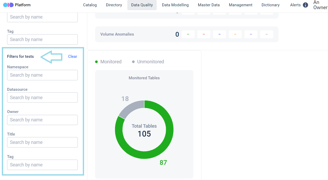
* **Tests-side filters** — narrow the Test Results Breakdown ring to tests with the selected attributes.
Filters for tests
The two filter sets are independent — you can hold the tables-side filter at one slice and the tests-side at another, which is useful when reasoning about test coverage across a slice of tables.
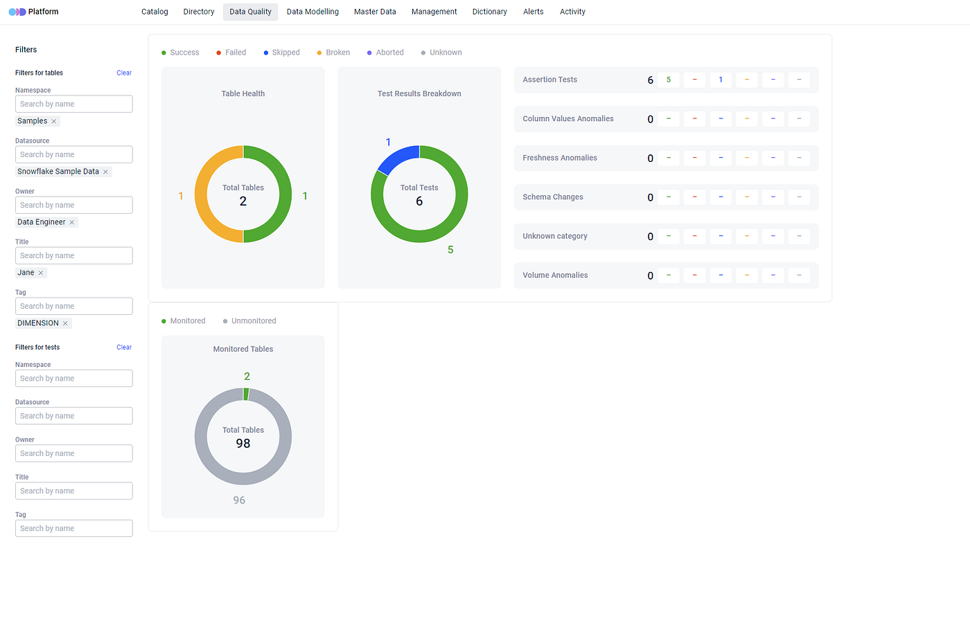
ODD users can narrow down test results for datasets by multiple attributes simultaneously.
Filtering by multiple attributes simultaneously
{% hint style="info" %}
**`AND`-only conjunction.** For simplicity the platform implements only one logical conjunction across filter dimensions — `AND`. The results displayed after filtering are the outcome of all selected filters intersected together.
{% endhint %}
{% hint style="warning" %}
**Filter selections are page-session state — they survive only if the URL survives.** The dashboard's filter state lives **per page mount**: selecting filters writes them to the URL query string in real time (a `replace` URL update, so the browser history isn't polluted), and re-opening the page re-reads the filters from that URL. The persistence is therefore tied to the URL, not to your session.
In practice:
* **Browser back** — preserves the URL → filters reconstruct correctly. Pick filters, drill into an entity, hit back, the filter row is the same.
* **Bookmarked or shared URL** — a `/data-quality?...` URL with filter parameters is a portable snapshot. Open it from a bookmark or paste it to a teammate; they land on the same filter set.
* **Clicking "Data Quality" in the top navigation** — that link points at bare `/data-quality` with no query string, so the page reopens with **all filters empty**. The most common surprise: you set up filters, navigate away through the top nav, click "Data Quality" again, and your selection is gone.
* **Re-opening the dashboard from another part of the catalog** — same as the top-nav case: unless you arrive via a URL that carries the filter parameters, the filter row starts empty.
The pattern (filter / cursor state resets when you leave the page through anything that doesn't preserve the URL) applies to a few other catalog surfaces — Owner Associations in Management, the DEG (Data Entity Group) lineage canvas, and the Dataset Structure compare view — but the Data Quality Dashboard is where most operators meet it first. To pin a working view, copy the URL from the address bar and bookmark or share it.
{% endhint %}
## Where to next
* [Test Results Import](/features/data-quality/test-results-import.md) — how the test results that populate the dashboard land in the catalog.
* [Dataset Quality Statuses (SLA)](/features/data-quality/sla-statuses.md) — operator-set severities on test results that feed the dataset-level SLA.
* [Alerting](/features/active-platform-features/alerting.md) — DQ-test-failed alerts feeding through the alert lifecycle.
* [Visibility for Data Quality Engineer](/use-cases/use-cases/dq-visibility.md) — the dashboard in the context of the DQ-engineer end-to-end workflow.